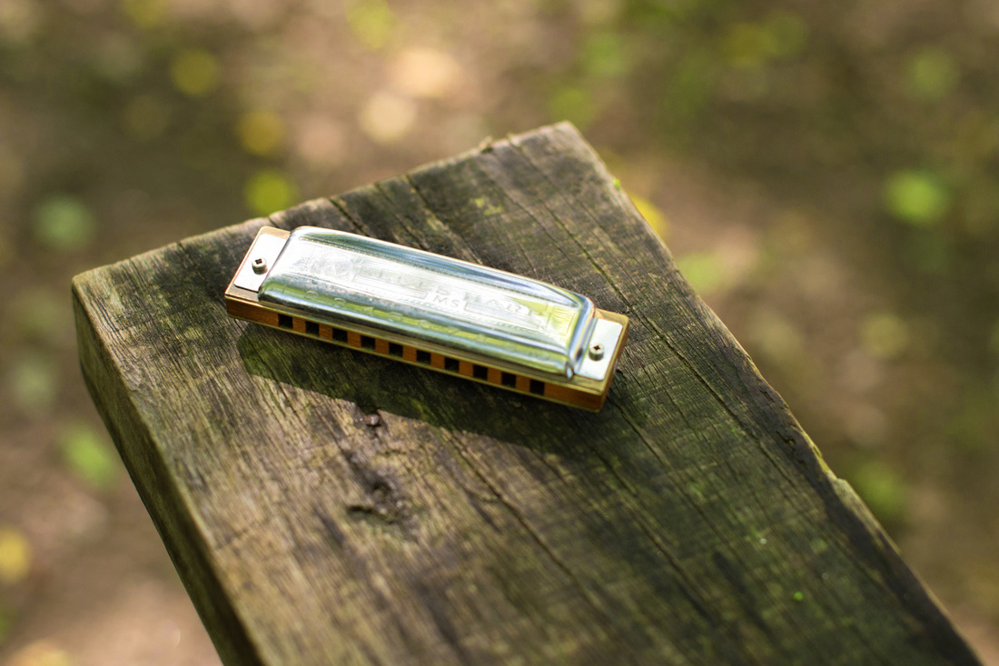
Soon I'll be letting you know about an exciting new project I'll be running this year. Here is a sneak peek. Keep dropping by, I'm sure you'll enjoy this at least as much as I enjoyed shooting it.

|
|
|
Soon I'll be letting you know about an exciting new project I'll be running this year. Here is a sneak peek. Keep dropping by, I'm sure you'll enjoy this at least as much as I enjoyed shooting it.
0 Comments
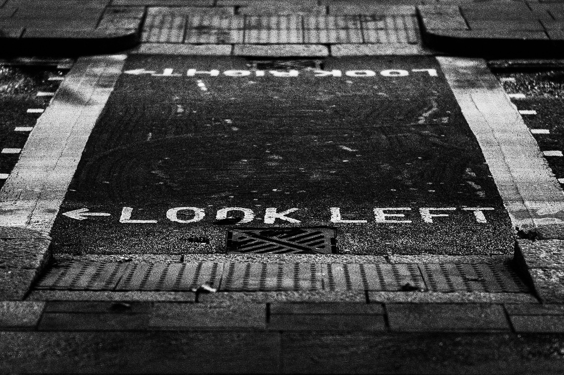
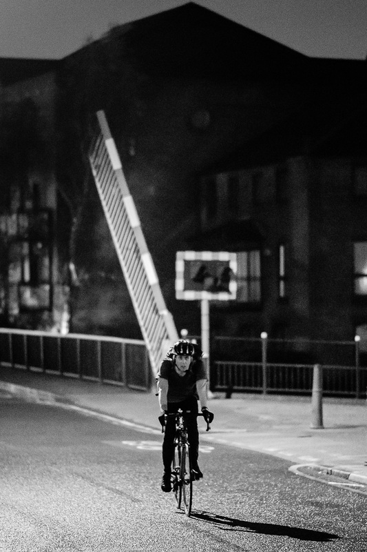
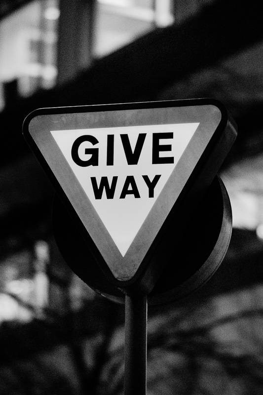
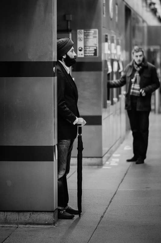
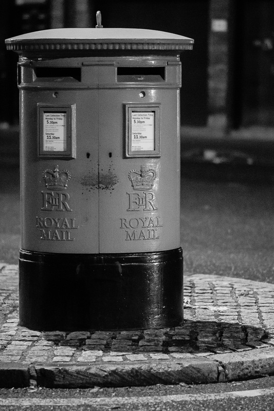
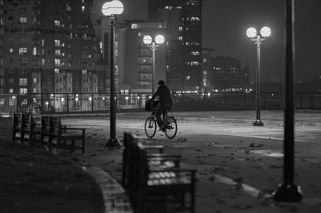
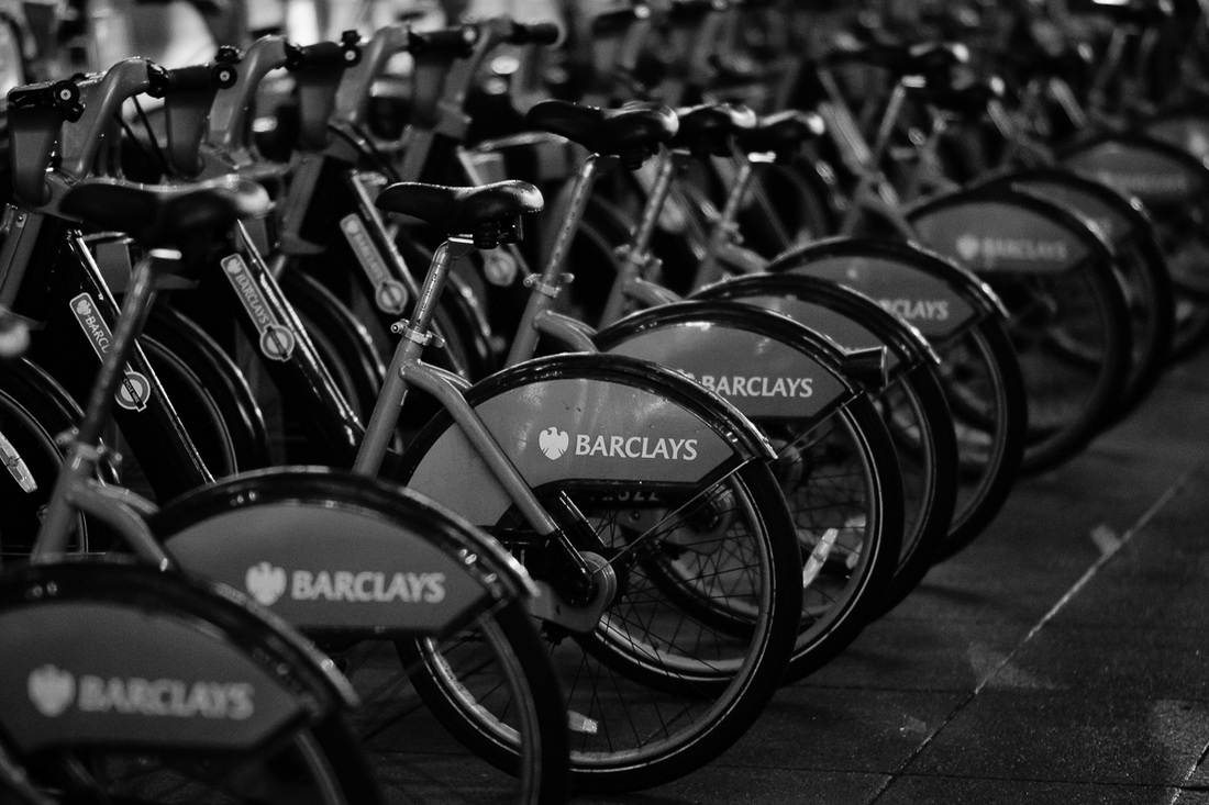
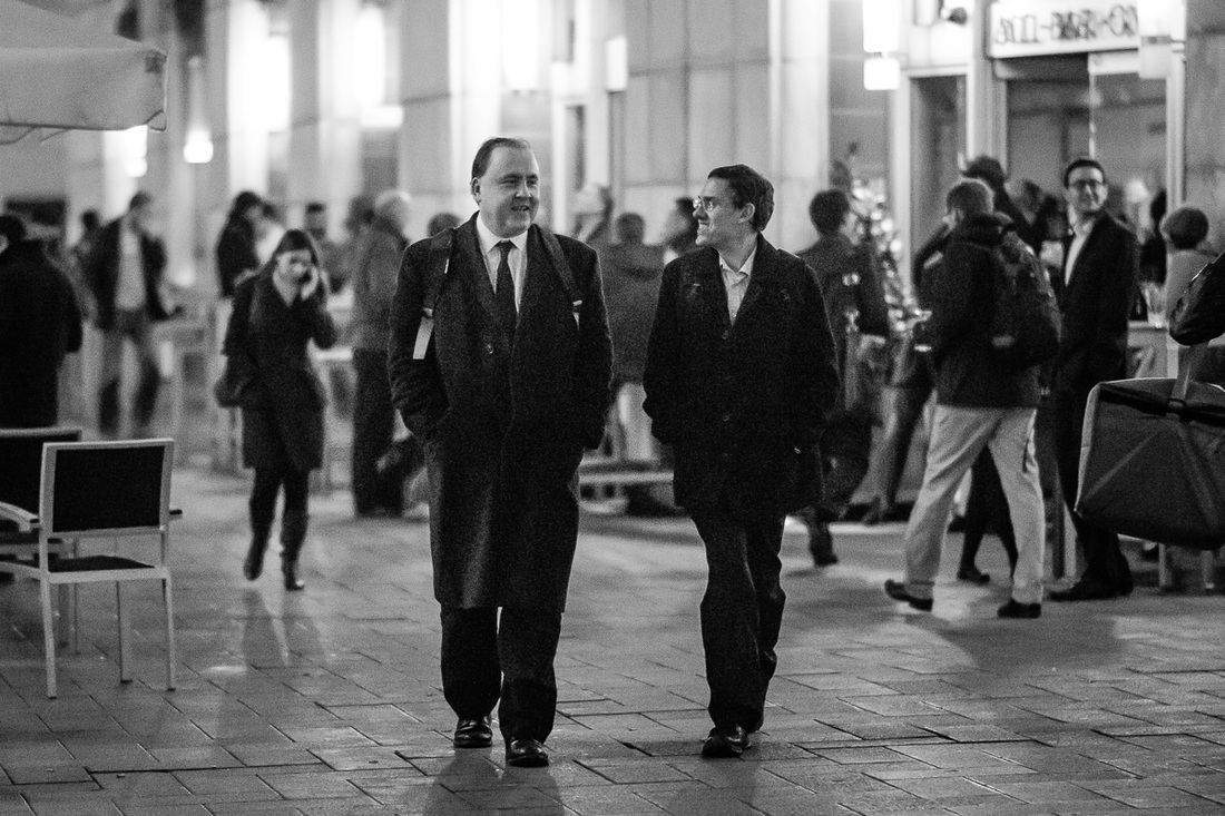
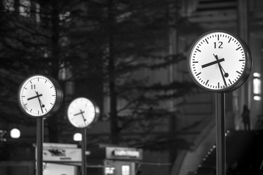
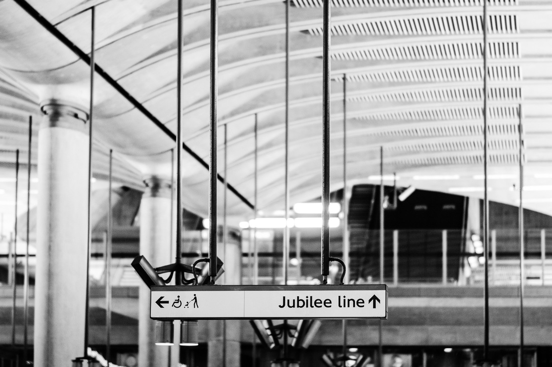
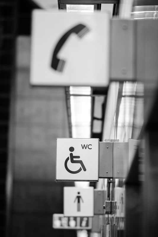
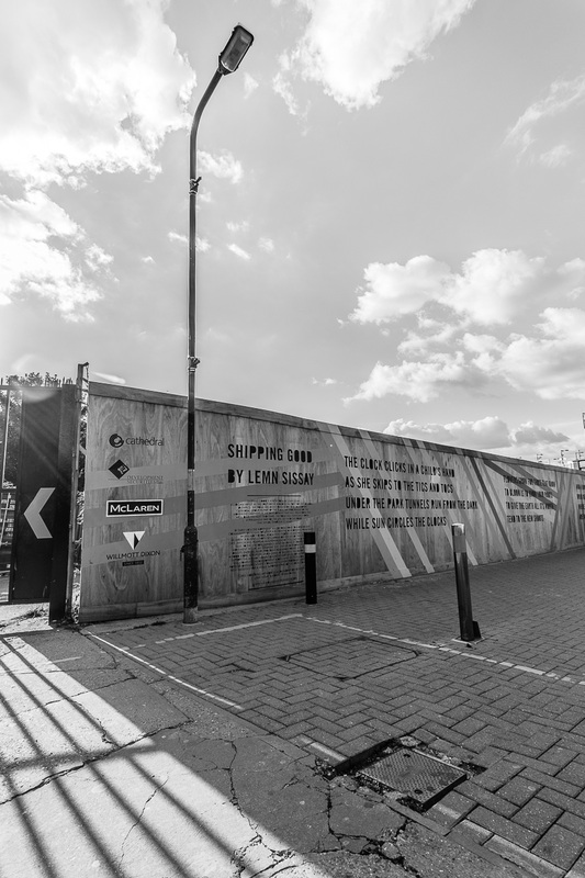
Today I'm publishing a series of fully manual monochromes that I made in the streets of London. I hope you enjoy them as much as I enjoyed producing them. Thanks for looking! 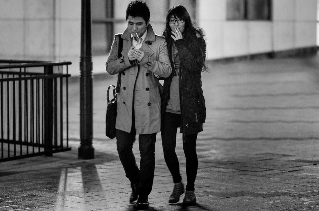


I receive lots of enquiries about the big impact of colour in my photographs. I've always wanted to start a series of posts with some tutorial value and I thought this is a great way to start it. Part of the job of a photographer is to know how to balance photographs so that it is possible to distinguish subtle differences in both the dark shades and the bright shades. The first and most important step is actually to capture the right amount of light into your photo (photographers usually use jargon words like "exposure" to refer to this), but I'm not going to go into that. Today I'm interested in talking about a recurring issue in digital photography. Back in the day, i.e. just a decade ago or so, people used to look at photographs on paper. There was matte, glossy, premium and consumer, but that was it: paper. These days people look at pictures in their iPhones, their Android phones, their iPads, their other tablets, their laptops, their desktops and all sorts of devices with digital displays. Displays in all these devices may be very different from each other and may use technologies that are utterly and fundamentally different. This is a problem. Photographers produce photographs that may look dramatically different depending on what display people are using to look at them. A lot of what we do in electronic devices is reading text that is very dark against a background that is very light, a task where subtleties in shades are not very important. Those subtle differences in shades of grey, or any other colour, tend to be more relevant in areas like fine art photography. Here is an image with fifty squares with fifty shades of grey. 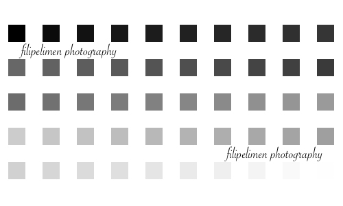 You are supposed to see all of them, and distinguish differences between them all. They are all different. There is a light grey square in the bottom right corner, which you are supposed to see against the white background. Also, you are supposed to be able to see differences in all dark squares in the top row.
If you can't see the full gamut of these fifty shades of grey, get yourself sorted! Calibrate your display or just find one where you can. Only then you'll be in a position of appreciating fine details in digital photography… or… print your photos in a good lab that does a good job at adjusting the colour standard of your photograph to their printing technology… but that is to be covered later. (I'm sorry if I disappointed everyone curious about my views on E. L. James's erotic novel or wondering whether I could report Anastasia Steele's actions in a photographic way.) |
AuthorFilipe Limen Archives
July 2014
Categories |
 RSS Feed
